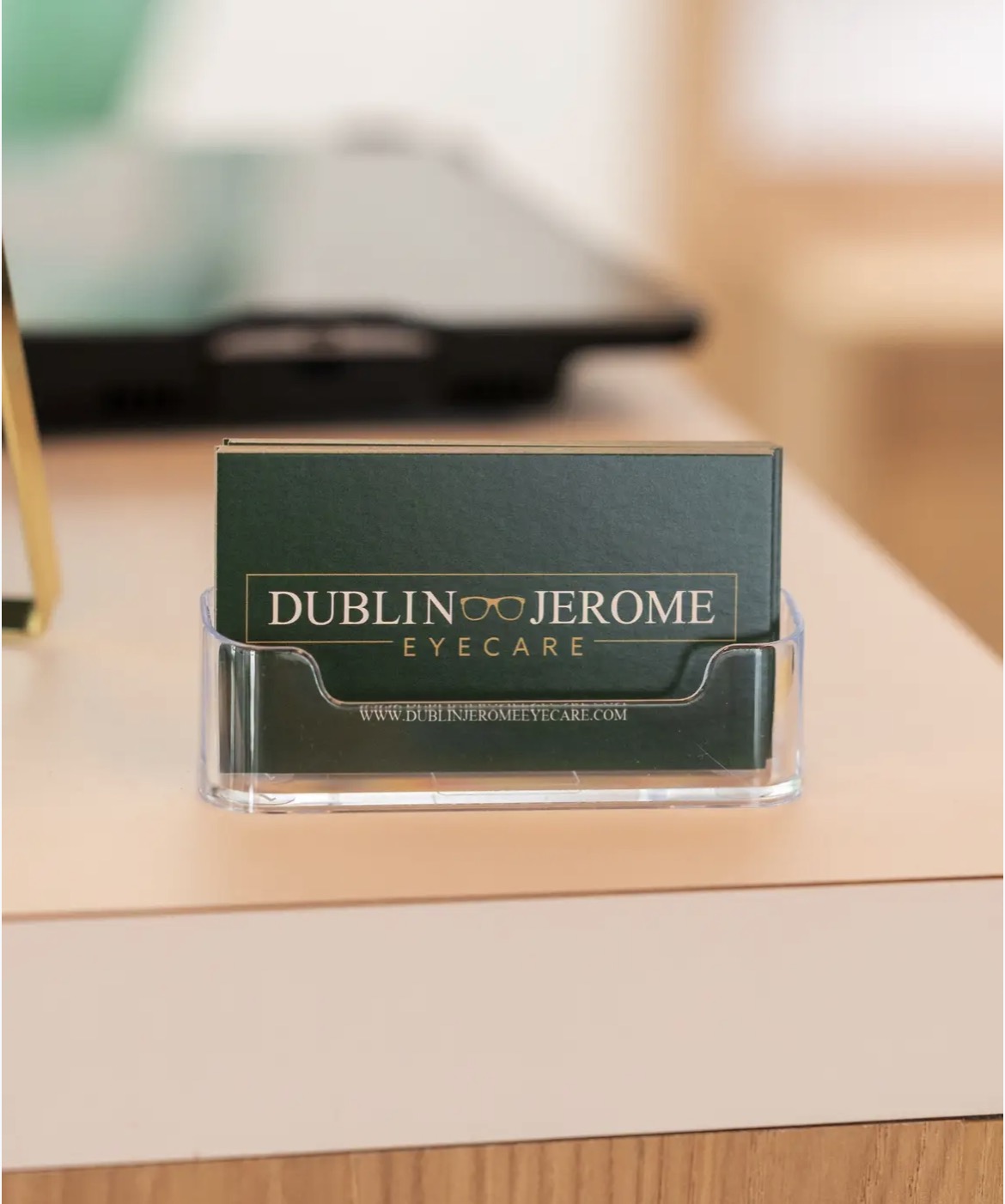


Every successful brand starts with a memorable first impression. For this project, I partnered with an independent eye care practice to create a custom logo and color palette that would establish trust, communicate professionalism, and create a recognizable identity across every customer touchpoint.
The goal wasn’t simply to design a logo—it was to build a visual foundation that the practice could grow with for years to come.
Understanding the Brand
Healthcare branding presents a unique challenge. Patients want to feel confident in a provider’s expertise while also feeling welcomed and cared for. The visual identity needs to strike the right balance between professionalism and approachability. For this project, I focused on creating a clean, timeless logo that reflected the practice’s commitment to quality patient care. Rather than following design trends that may quickly become outdated, the branding was intentionally created to feel modern, versatile, and long-lasting.

Creating a Cohesive Color Palette
A logo is only one piece of a successful brand identity. I also developed a complementary color palette that supports the practice’s personality across digital and print materials.

Thoughtfully selected colors help create consistency while reinforcing the emotions a brand wants customers to experience. For healthcare businesses, this often means using colors that evoke trust, clarity, and comfort without feeling overly clinical.
The resulting palette provides flexibility for websites, printed materials, social media, and future marketing efforts while maintaining a cohesive look and feel.
Designing Beyond the Logo
One of the most important parts of logo design is ensuring it works everywhere.
For this project, the identity was created to remain clear and recognizable across a variety of applications, including:
- Websites
- Business cards
- Appointment materials
- Signage
- Social media graphics
- Promotional items
- Digital advertising
A well-designed logo should feel just as strong on a storefront sign as it does in the corner of a website or on a mobile device.
Why Strategic Branding Matters
Strong branding helps businesses become memorable. While products and services are what customers ultimately purchase, visual identity often influences the first impression.
A professionally designed logo and cohesive color palette communicate credibility before a customer ever makes contact. Consistent branding also helps businesses stand out in competitive markets by creating familiarity and recognition over time.
Whether it’s a healthcare provider, small business, or growing company, investing in a thoughtful brand identity creates a stronger foundation for future marketing.
The End Result
This project resulted in a clean, modern visual identity that reflects professionalism while remaining approachable and welcoming. The logo and color palette were designed to support the practice across both digital and physical spaces, creating consistency wherever customers interact with the brand.
Creating custom branding is one of my favorite parts of the design process because every business has a unique story to tell. A logo should do more than look good—it should represent the personality, values, and future of the business it serves.
If you’re looking for a custom logo, brand identity, or color palette for your business, I’d love to help create something that’s uniquely yours and built to grow with your brand.
More Than just a Logo
One of my favorite parts of this project was creating a complete logo system rather than a single standalone logo.
Different marketing materials require different logo layouts. A horizontal logo may be perfect for a website header, while a stacked or simplified version works better on social media, signage, promotional products, or printed materials. By designing multiple logo variations, the brand can stay consistent no matter where it’s displayed.
In addition to multiple layouts, I also created several color variations of the logo. Having full-color, single-color, and reversed versions ensures the logo remains effective on light backgrounds, dark backgrounds, printed materials, embroidered apparel, and promotional items.
Providing a complete logo system gives my clients flexibility without sacrificing brand consistency. Instead of trying to make one logo fit every situation, they have professionally designed versions ready for whatever comes next.

Leave a Reply